Agna Studio
Location: Bangalore, India
CHALLENGE
A well-known visual media studio specializing in Photography, Videography, and Motion Graphics was looking to revamp and consolidate its brand identity system. They work with some of the largest brands in the country and this is their first brand refresh since their inception, 11 years ago.
INSIGHT
The brand was built primarily through word of mouth and referrals. And after getting to know the ethos of the company, we realized that the brand was truly human-centric. The people behind this brand spend as much time as is required to understand the stories of the people they capture through the eyes of their cameras. This became the foundation upon which we built the new identity system.
SOLUTION
The parent brand called AGNA [Ājñā] stands for the third eye in Sanskrit. As per Hindu beliefs, the two physical eyes enable the person to see the physical world, while the third eye is believed to help people connect with their intuition and communicate with the world. This was already synonymous with the foundations upon which the brand was built. So we built on it and fleshed out the brand philosophy around People, Emotions, and Passion. We then crafted a complete and cohesive brand identity system for the primary and sub-brands, giving the company a fresh face and a powerful story to share with the world, while keeping their core identity intact.
THE SCOPE
Brand Identity Development
Brand Story
Brand Persona
Positioning & Messaging
Marketing Communication Content
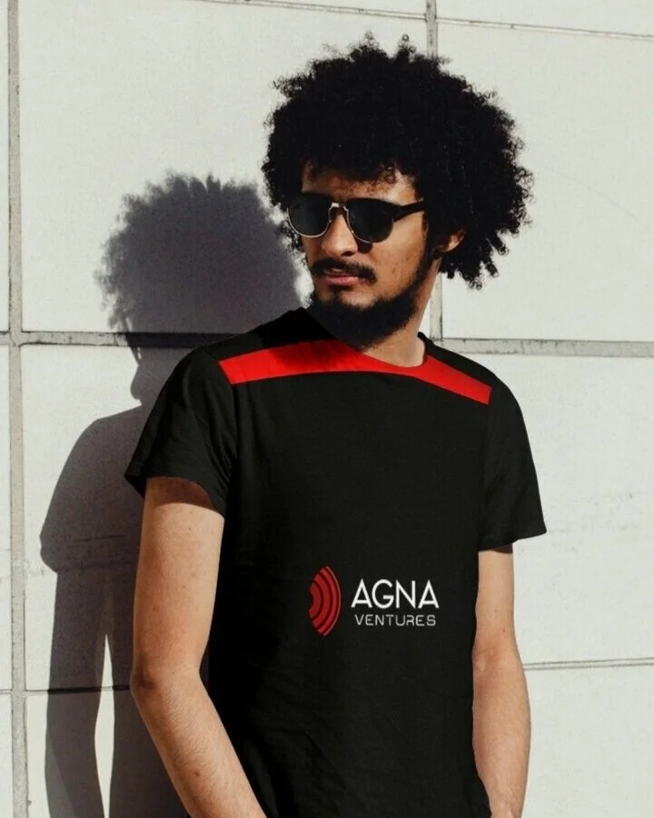
Drawing inspiration from the visual of an eye, represented by the word Agna, as well as the eye of the camera, we developed an abstract visual unit.
We selected the color red for the parent logo unit to reflect the vibrant yet human essence that goes into the art of capturing visual stories.
The identities of the sub-brands drew inspiration from the parent logo unit, while retaining their distinctive personalities.


